This variant uses the native HTML <dialog> element and should be the default choice for modern projects.
Use this variant when you need modal behaviour with low implementation effort and reliable built-in browser handling.
<svgid="definition"version="1.1"xmlns="http://www.w3.org/2000/svg"><defs><symbolid="close-icon"viewbox="0 0 51.976 51.976"><g><pathd="M44.373,7.603c-10.137-10.137-26.632-10.138-36.77,0c-10.138,10.138-10.137,26.632,0,36.77s26.632,10.138,36.77,0 C54.51,34.235,54.51,17.74,44.373,7.603z M36.241,36.241c-0.781,0.781-2.047,0.781-2.828,0l-7.425-7.425l-7.778,7.778 c-0.781,0.781-2.047,0.781-2.828,0c-0.781-0.781-0.781-2.047,0-2.828l7.778-7.778l-7.425-7.425c-0.781-0.781-0.781-2.048,0-2.828 c0.781-0.781,2.047-0.781,2.828,0l7.425,7.425l7.071-7.071c0.781-0.781,2.047-0.781,2.828,0c0.781,0.781,0.781,2.047,0,2.828 l-7.071,7.071l7.425,7.425C37.022,34.194,37.022,35.46,36.241,36.241z"></path></g></symbol></defs></svg><scripttype="module"asyncsrc="https://unpkg.com/invokers-polyfill@latest/invoker.min.js"
></script><button>Focusable element before</button><h2>Example page content</h2><p>
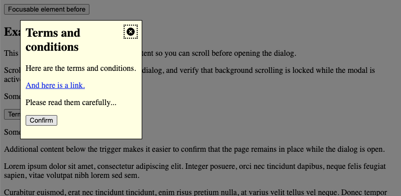
This example includes additional page content so you can scroll before opening the dialog.
</p><p>
Scroll down to the trigger, open the dialog, and verify that background scrolling is locked while the modal is active.
</p><p>
Some text before.
</p><p><buttontype="button"command="show-modal"commandfor="my-dialog"aria-haspopup="dialog">Terms and conditions</button></p><p>
Some text after.
</p><p>
Additional content below the trigger makes it easier to confirm that the page remains in place while the dialog is open.
</p><p>
Lorem ipsum dolor sit amet, consectetur adipiscing elit. Integer posuere, orci nec tincidunt dapibus, neque felis feugiat sapien, vitae volutpat nibh lorem sed sem.
</p><p>
Curabitur euismod, erat nec tincidunt tincidunt, enim risus pretium nulla, at varius velit tellus vel neque. Donec tempor feugiat sem, ut suscipit nibh lacinia vitae.
</p><p>
Sed sit amet magna id sem fermentum suscipit. Nullam feugiat, urna quis finibus vulputate, dui purus pretium est, vitae luctus magna velit at lorem.
</p><p>
Vivamus luctus mauris ut libero tincidunt, at porttitor lectus porttitor. Aliquam erat volutpat. Suspendisse potenti.
</p><p>
Pellentesque habitant morbi tristique senectus et netus et malesuada fames ac turpis egestas. Vestibulum volutpat nisl ac neque posuere, vitae placerat justo dictum.
</p><p>
Integer convallis risus et purus gravida, at lacinia leo volutpat. Cras non nisl eu justo condimentum pretium.
</p><button>Focusable element after</button><dialogclass="adg-dialog"id="my-dialog"aria-labelledby="my-dialog-heading"aria-describedby="my-dialog-description"><buttontype="button"class="adg-dialog-icon"command="close"commandfor="my-dialog"autofocus><svgclass="icon"focusable="false"><usexlink:href="#close-icon" /></svg><spanclass="visually-hidden">Close dialog</span></button><h2id="my-dialog-heading">
Terms and conditions
</h2><pid="my-dialog-description">
Here are the terms and conditions.
</p><p><ahref="#">And here is a link.</a></p><p>
Please read them carefully...
</p><p><buttontype="button"command="close"commandfor="my-dialog">Confirm</button></p></dialog>
Activation: Use Invoker Commands (command="show-modal" and command="close" with commandfor) to open and close the dialog. The example page loads invoker.min.js from a CDN where Invoker Commands are not supported yet.
Backdrop: Style using the ::backdrop pseudo-element.
Keyboard behaviour: Browsers generally keep focus within the dialog and support closing via Esc, consistent with platform conventions.
Focus return: Browsers typically restore focus to the previously focused element when the dialog closes.
Initial focus: Use autofocus on a meaningful control inside the dialog (for example the close button), or follow the guidance in Initial focus positioning below.
State: Do not rely on the open attribute alone for modal behaviour.
Non-modal dialog
This variant uses the native <dialog> element opened with HTMLDialogElement.show(). The page stays interactive: no top-layer inertness, no ::backdrop, and no focus trap.
Use this when you need a floating panel that behaves like a classic non-modal dialog and you are fine calling show() / close() from script (Invoker Commands only define show-modal and close, not show).
<svgid="definition"version="1.1"xmlns="http://www.w3.org/2000/svg"><defs><symbolid="close-icon"viewbox="0 0 51.976 51.976"><g><pathd="M44.373,7.603c-10.137-10.137-26.632-10.138-36.77,0c-10.138,10.138-10.137,26.632,0,36.77s26.632,10.138,36.77,0 C54.51,34.235,54.51,17.74,44.373,7.603z M36.241,36.241c-0.781,0.781-2.047,0.781-2.828,0l-7.425-7.425l-7.778,7.778 c-0.781,0.781-2.047,0.781-2.828,0c-0.781-0.781-0.781-2.047,0-2.828l7.778-7.778l-7.425-7.425c-0.781-0.781-0.781-2.048,0-2.828 c0.781-0.781,2.047-0.781,2.828,0l7.425,7.425l7.071-7.071c0.781-0.781,2.047-0.781,2.828,0c0.781,0.781,0.781,2.047,0,2.828 l-7.071,7.071l7.425,7.425C37.022,34.194,37.022,35.46,36.241,36.241z"></path></g></symbol></defs></svg><scripttype="module"asyncsrc="https://unpkg.com/invokers-polyfill@latest/invoker.min.js"
></script><buttontype="button">Focusable element before</button><h2>Example page content</h2><p>
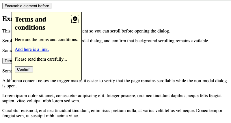
This example includes additional page content so you can scroll before opening the dialog.
</p><p>
Scroll down to the trigger, open the non-modal dialog, and confirm that background scrolling remains available.
</p><p>
Some text before.
</p><p><buttontype="button"id="my-dialog-opener"aria-expanded="false"aria-haspopup="dialog">
Terms and conditions
<spanclass="visually-hidden"> (dialog)</span></button></p><p>
Some text after.
</p><p>
Additional content below the trigger makes it easier to verify that the page remains scrollable while the non-modal dialog is open.
</p><p>
Lorem ipsum dolor sit amet, consectetur adipiscing elit. Integer posuere, orci nec tincidunt dapibus, neque felis feugiat sapien, vitae volutpat nibh lorem sed sem.
</p><p>
Curabitur euismod, erat nec tincidunt tincidunt, enim risus pretium nulla, at varius velit tellus vel neque. Donec tempor feugiat sem, ut suscipit nibh lacinia vitae.
</p><p>
Sed sit amet magna id sem fermentum suscipit. Nullam feugiat, urna quis finibus vulputate, dui purus pretium est, vitae luctus magna velit at lorem.
</p><p>
Vivamus luctus mauris ut libero tincidunt, at porttitor lectus porttitor. Aliquam erat volutpat. Suspendisse potenti.
</p><p>
Pellentesque habitant morbi tristique senectus et netus et malesuada fames ac turpis egestas. Vestibulum volutpat nisl ac neque posuere, vitae placerat justo dictum.
</p><p>
Integer convallis risus et purus gravida, at lacinia leo volutpat. Cras non nisl eu justo condimentum pretium.
</p><buttontype="button">Focusable element after</button><dialogclass="adg-dialog"id="my-dialog"aria-labelledby="my-dialog-heading"aria-describedby="my-dialog-description"><buttontype="button"class="adg-dialog-icon"command="close"commandfor="my-dialog"autofocus><svgclass="icon"focusable="false"><usexlink:href="#close-icon" /></svg><spanclass="visually-hidden">Close dialog</span></button><h2id="my-dialog-heading">
Terms and conditions
</h2><pid="my-dialog-description">
Here are the terms and conditions.
</p><p><ahref="#">And here is a link.</a></p><p>
Please read them carefully...
</p><p><buttontype="button"command="close"commandfor="my-dialog">Confirm<spanclass="visually-hidden"> (close)</span></button></p></dialog>
Activation: Call .show() to open and .close() to dismiss, or use Invoker Commands for close only (command="close" with commandfor) plus a small script for the opener. The example page loads invoker.min.js from a CDN for close controls where Invoker Commands are not supported yet.
State indication: Set aria-expanded on the trigger when you toggle open/closed from script.
Focus handling: Move focus to a meaningful element when opened (for example via autofocus). Note that while the strict WAI-ARIA APG pattern suggests containing the tab sequence inside non-modal dialogs (with explicit means to exit), a <dialog> opened with .show() typically allows users to tab out naturally into the document order.
Keyboard:Esc does not close a non-modal dialog by default; provide an explicit close control or handle cancel if you need it.
DOM position: Place markup close to the trigger to preserve logical tab order.
Dialog with Popover API
This variant also keeps the page interactive, but it is not the same as .show(): you add the popover attribute to <dialog> (or another element) and use the Popover API. Declarative open/close is available via Invoker Commands (command="toggle-popover" / command="hide-popover" with commandfor) or popovertarget / popovertargetaction.
Use this when you want top-layer promotion, optional light dismiss, and invoker-driven toggling without writing open/close logic yourself.
<svgid="definition"version="1.1"xmlns="http://www.w3.org/2000/svg"><defs><symbolid="close-icon"viewbox="0 0 51.976 51.976"><g><pathd="M44.373,7.603c-10.137-10.137-26.632-10.138-36.77,0c-10.138,10.138-10.137,26.632,0,36.77s26.632,10.138,36.77,0 C54.51,34.235,54.51,17.74,44.373,7.603z M36.241,36.241c-0.781,0.781-2.047,0.781-2.828,0l-7.425-7.425l-7.778,7.778 c-0.781,0.781-2.047,0.781-2.828,0c-0.781-0.781-0.781-2.047,0-2.828l7.778-7.778l-7.425-7.425c-0.781-0.781-0.781-2.048,0-2.828 c0.781-0.781,2.047-0.781,2.828,0l7.425,7.425l7.071-7.071c0.781-0.781,2.047-0.781,2.828,0c0.781,0.781,0.781,2.047,0,2.828 l-7.071,7.071l7.425,7.425C37.022,34.194,37.022,35.46,36.241,36.241z"></path></g></symbol></defs></svg><scripttype="module"asyncsrc="https://unpkg.com/invokers-polyfill@latest/invoker.min.js"
></script><buttontype="button">Focusable element before</button><h2>Example page content</h2><p>
This example includes additional page content so you can scroll before opening the dialog.
</p><p>
Scroll down to the trigger, open the dialog popover, and confirm that background scrolling remains available. You can also close it by clicking outside or pressing Esc.
</p><p>
Some text before.
</p><p><buttontype="button"command="toggle-popover"commandfor="my-dialog"aria-haspopup="dialog">
Terms and conditions
<spanclass="visually-hidden"> (dialog)</span></button></p><p>
Some text after.
</p><p>
Additional content below the trigger makes it easier to verify that the page remains scrollable while the dialog popover is open.
</p><p>
Lorem ipsum dolor sit amet, consectetur adipiscing elit. Integer posuere, orci nec tincidunt dapibus, neque felis feugiat sapien, vitae volutpat nibh lorem sed sem.
</p><p>
Curabitur euismod, erat nec tincidunt tincidunt, enim risus pretium nulla, at varius velit tellus vel neque. Donec tempor feugiat sem, ut suscipit nibh lacinia vitae.
</p><p>
Sed sit amet magna id sem fermentum suscipit. Nullam feugiat, urna quis finibus vulputate, dui purus pretium est, vitae luctus magna velit at lorem.
</p><p>
Vivamus luctus mauris ut libero tincidunt, at porttitor lectus porttitor. Aliquam erat volutpat. Suspendisse potenti.
</p><p>
Pellentesque habitant morbi tristique senectus et netus et malesuada fames ac turpis egestas. Vestibulum volutpat nisl ac neque posuere, vitae placerat justo dictum.
</p><p>
Integer convallis risus et purus gravida, at lacinia leo volutpat. Cras non nisl eu justo condimentum pretium.
</p><buttontype="button">Focusable element after</button><dialogclass="adg-dialog"id="my-dialog"popover="auto"aria-labelledby="my-dialog-heading"aria-describedby="my-dialog-description"><buttontype="button"class="adg-dialog-icon"command="hide-popover"commandfor="my-dialog"autofocus><svgclass="icon"focusable="false"><usexlink:href="#close-icon" /></svg><spanclass="visually-hidden">Close dialog</span></button><h2id="my-dialog-heading">
Terms and conditions
</h2><pid="my-dialog-description">
Here are the terms and conditions.
</p><p><ahref="#">And here is a link.</a></p><p>
Please read them carefully...
</p><p><buttontype="button"command="hide-popover"commandfor="my-dialog">Confirm<spanclass="visually-hidden"> (close)</span></button></p></dialog>
Activation: Set popover on the <dialog> (for example popover="auto" for light dismiss, or popover="manual" to require an explicit close control).
Invoker Commands:toggle-popover, show-popover, and hide-popover map to the Popover API; the example page loads invoker.min.js from a CDN where needed.
Light dismiss: With popover="auto", clicking outside or pressing Esc closes the popover by default.
Focus handling: Popover semantics differ from .show(); invoker buttons may receive implicit aria-expanded / aria-details. Tab order follows popover and browser conventions rather than the non-modal dialog APG focus loop.
Semantics: The element remains a <dialog> in the DOM, but runtime behaviour follows the Popover API once popover is set.
Custom modal dialog (Legacy)
This variant recreates modal dialog behaviour with ARIA semantics and custom JavaScript logic.
Use this only when native <dialog> cannot be used. Prefer the modal dialog example for new projects.
Role and name: Use role="dialog" and aria-labelledby.
Focus trap: Implement manual focus management for Tab and Shift + Tab.
Keyboard interaction: Provide an explicit Esc handler.
Inertness: Mark background content as inert (or equivalent) while open.
Alert dialogs
For brief, important messages that require a response (for example confirming deletion), use the WAI-ARIA Alert Dialog Pattern with role="alertdialog".
Set aria-describedby on the element that contains the alert message.
For destructive or hard-to-reverse actions, set initial focus on the least destructive control (for example Cancel rather than Delete). See Initial focus positioning below.
The Terms and conditions examples on this page are informational modals, not alert dialogs.
Best practices & edge cases
Headings in dialogs
Modal dialogs: May act as self-contained contexts; <h2> is usually a safe default.
Non-modal dialogs and dialog popovers: Should follow the existing page hierarchy.
Positioning in the DOM
Native <dialog>: Placement is flexible, but proximity to the trigger improves maintainability.
Custom dialogs: Often placed at the end of <body> to avoid layout issues.
Initial focus positioning
By default, focus the first focusable element in the dialog. Consider these exceptions:
Destructive actions: For confirmation dialogs (e.g. deletion), focus Cancel rather than Delete to reduce accidental data loss. See Alert dialogs.
Long content: Focus the dialog title (tabindex="-1") so screen readers start reading from the top of the content.
Backdrop interaction
Users often expect a modal to close when they click the backdrop. This is a common UX preference, not a requirement of the Dialog Modal Pattern.
Implementation: With native modal <dialog>, listen for clicks on the dialog element and call .close() only when the click lies outside the dialog panel. The backdrop is part of the dialog’s box model; comparing click coordinates to getBoundingClientRect() avoids closing the dialog when the user clicks inside the content.
const dialog = document.querySelector('dialog')

dialog.addEventListener('click', event => {
  const rect = dialog.getBoundingClientRect()
  const isInDialog =
    event.clientX >= rect.left &&
    event.clientX <= rect.right &&
    event.clientY >= rect.top &&
    event.clientY <= rect.bottom

  // Click was outside the dialog panel (on the backdrop)
  if (!isInDialog) {
    dialog.close()
  }
})
Preventing background scrolling
When a modal is open, background page content should not be scrollable.
Native:.showModal() makes the background inert, but to reliably prevent scroll chaining, add a CSS rule like body:has(dialog[open]:modal) { overflow: hidden; }.
Custom: Use inert on background content and a visual backdrop; avoid relying on overflow: hidden alone when inert is available.